

because of the way it hides the information pane in the centre. Rolling over splits the graph and shows information. Quite clever.
I also really liked this one:
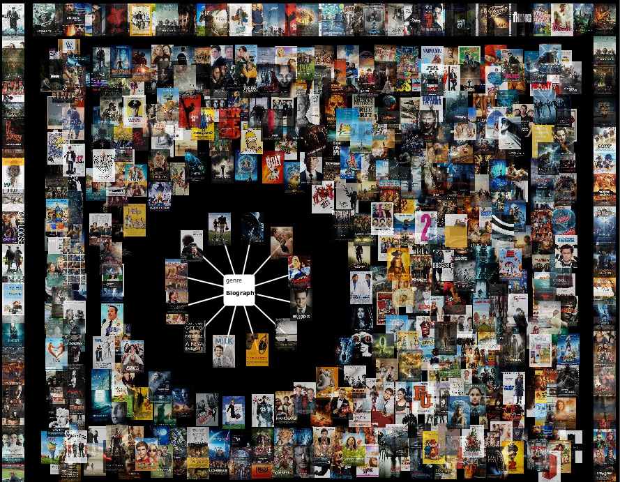
The great part about this is the whole idea of a magnet. A magnet is our query on the database, so to say, and dropping it into the pool of datasets, literally, brings the data points of interest together. This concept is very potent and could be used for several other applications. Of course, there are drawbacks too. The problem here is that it shows only one kind of relationship through the magnet metaphor. It is telling me, 'you want to look at these data points', but its not telling me why. I guess this idea of a magnet representing one's query is an excellent entry point into a data visualization system which then later gives choices of trends, scatter plots and other visualizations anyway.
No comments:
Post a Comment